
Project Summary
Famila is a hypermarket offering a wide range of products, from food to clothes. To enhance customer engagement and increase spending, Famila sought to integrate a loyalty program into their existing app. The program involves users earning stamps by purchasing groceries, which can be redeemed for rewards within the app. Additionally, users must register with their email to build an active user database for email marketing.
Problem Statement
Famila lacks consumer empathy, and there has been minimal change in spending behavior despite having an app. App downloads and usage are low, leading to limited screen time. The app's user experience requires an update. The registered user email database is insufficient compared to the store's customer base, resulting in ineffective newsletters.
Design Process
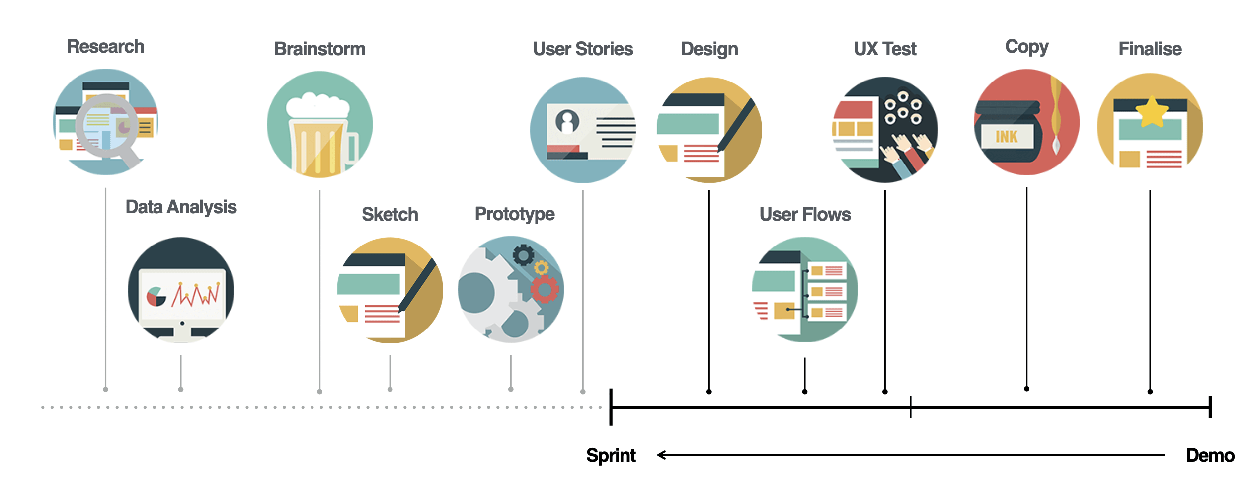
To address these issues, the design process involved thorough research and user interviews.
Research
I conducted interviews with both frequent and non-frequent Famila shoppers, employing video interviews and WhatsApp conversations. These interviews provided valuable data.
"Not much happening
in the app"
Additionally, I researched the UX of the current app and presented my findings to the client, identifying areas that needed improvement to ensure a complete UX experience.
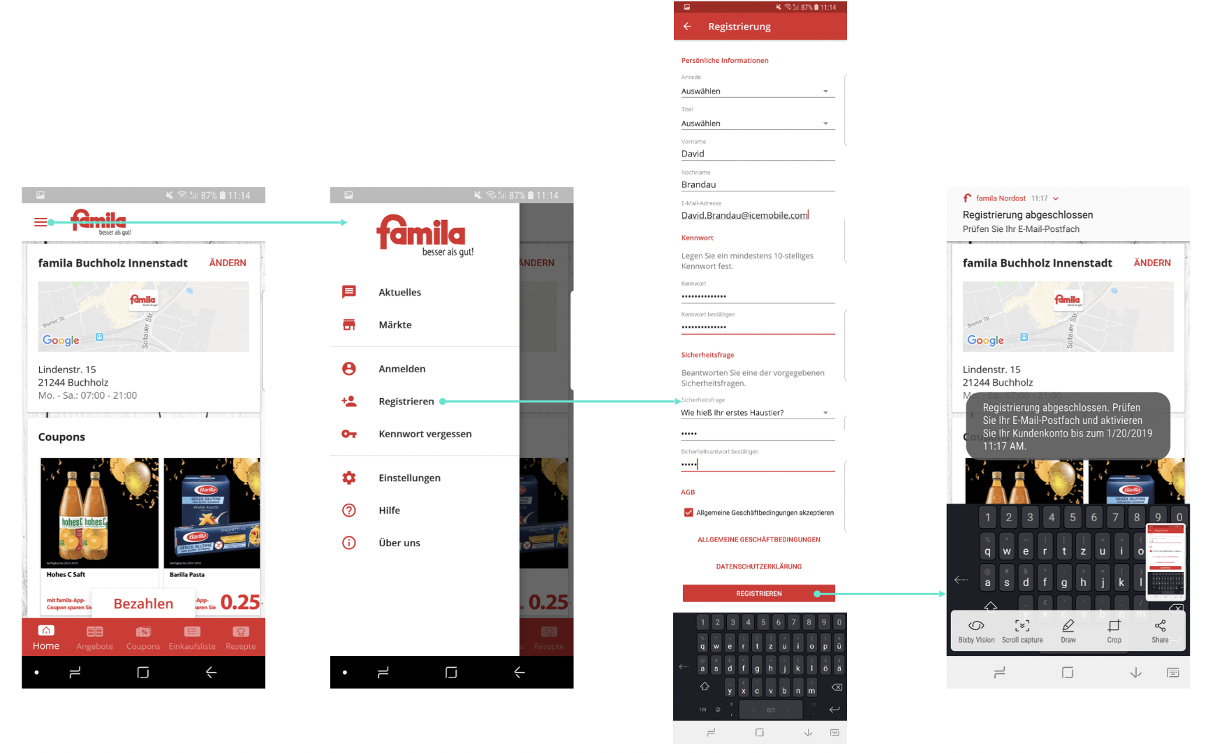
- The registry page contains excessive information, potentially overwhelming users during the registration process.
- The app's visual design relies heavily on the color red, leading to visual clutter and possibly reducing user engagement.
- Simplifying the registry page, adopting a balanced color scheme, and enhancing the visual aesthetics can improve the overall user experience and increase adoption of the loyalty program.
Pain Points
Based on user interviews, I identified key pain points to guide the app's development:
1. Lack of Incentive
Users did not find enough reasons to use the app frequently beyond checking discounts and coupons. The app lacked excitement, leading users to close it after brief interactions.
2. Static Feel
The app lacked interactive elements, making users feel disconnected and uninterested in using it.
3. Lack of App Value
Users saw no compelling reason to download the app, as discounts and coupons alone were insufficient. The app offered no additional benefits while shopping at Famila.
Sketches
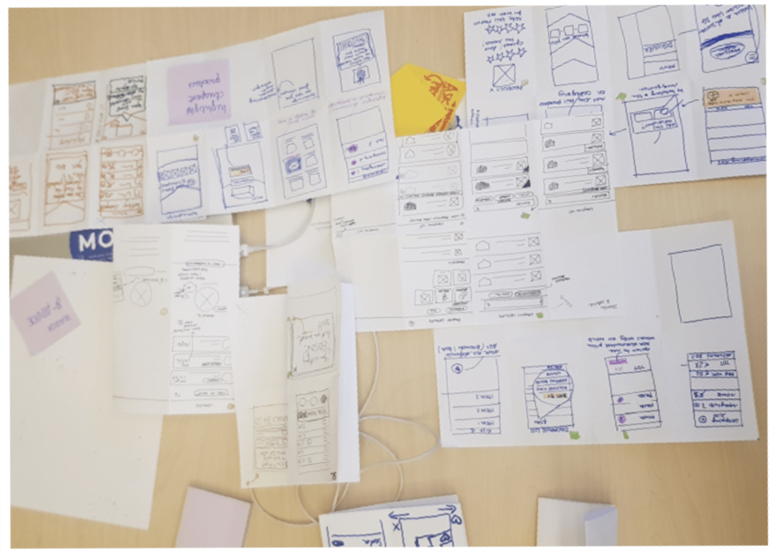
Using the gathered information, I created sketches to explore potential solutions and rapidly iterate ideas.
User flow / Wireframes
I developed user flows and wireframes to depict the steps for registration, joining the Stamps program (for both registered and unregistered users), collecting stamps, and redeeming rewards.
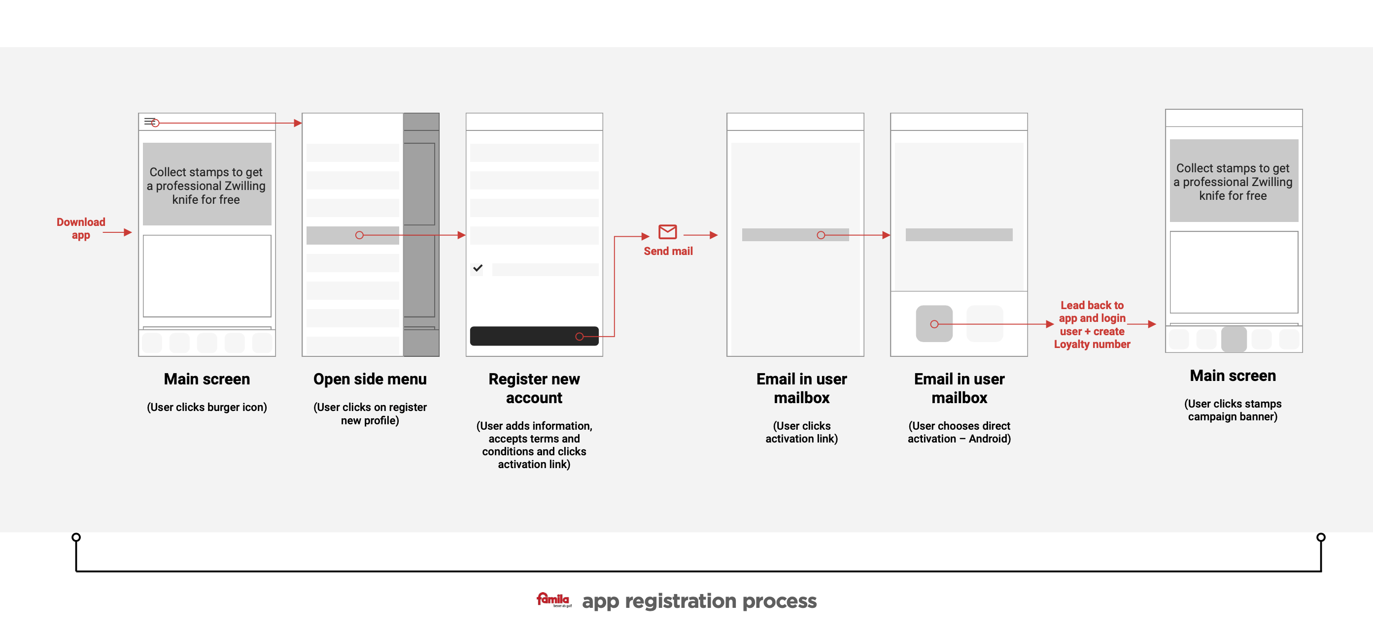
1. Registration (New famila app user)
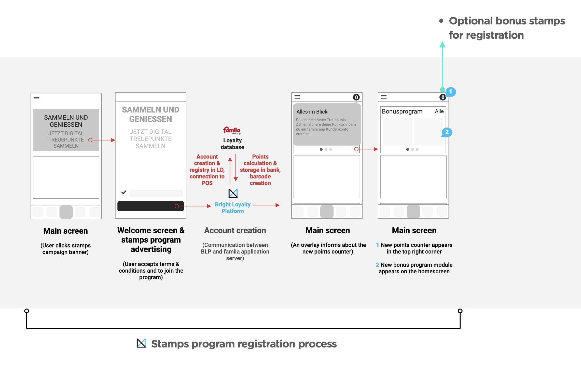
2. Join Stamps program (registered user)
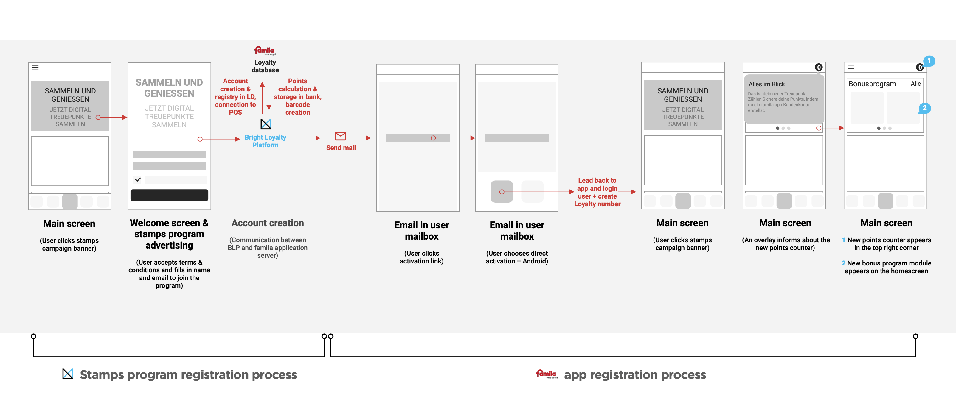
3. Join Stamps program (unregistered user)
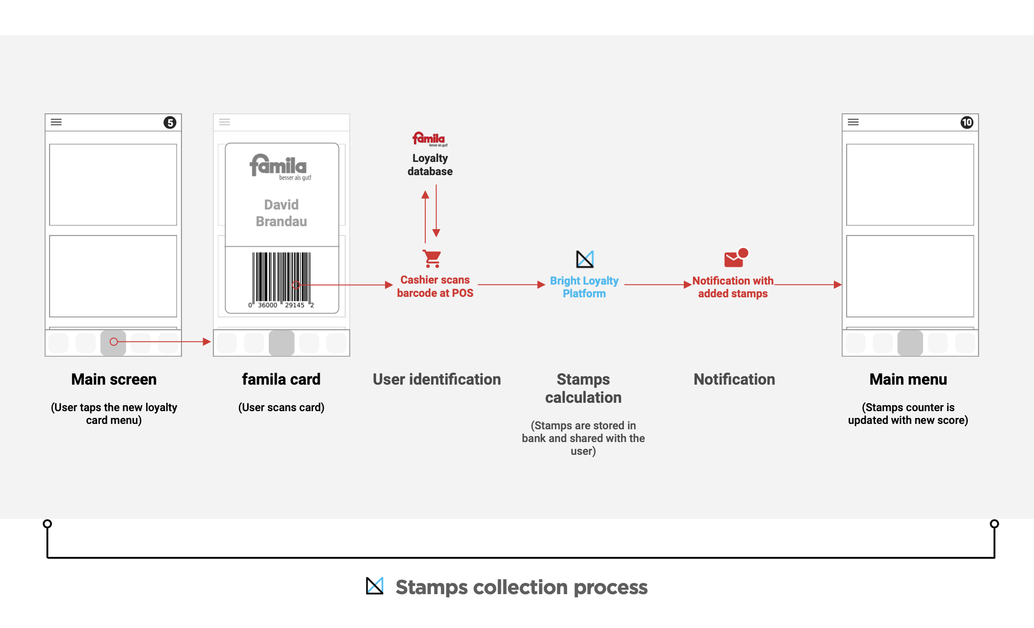
4. Collect stamps
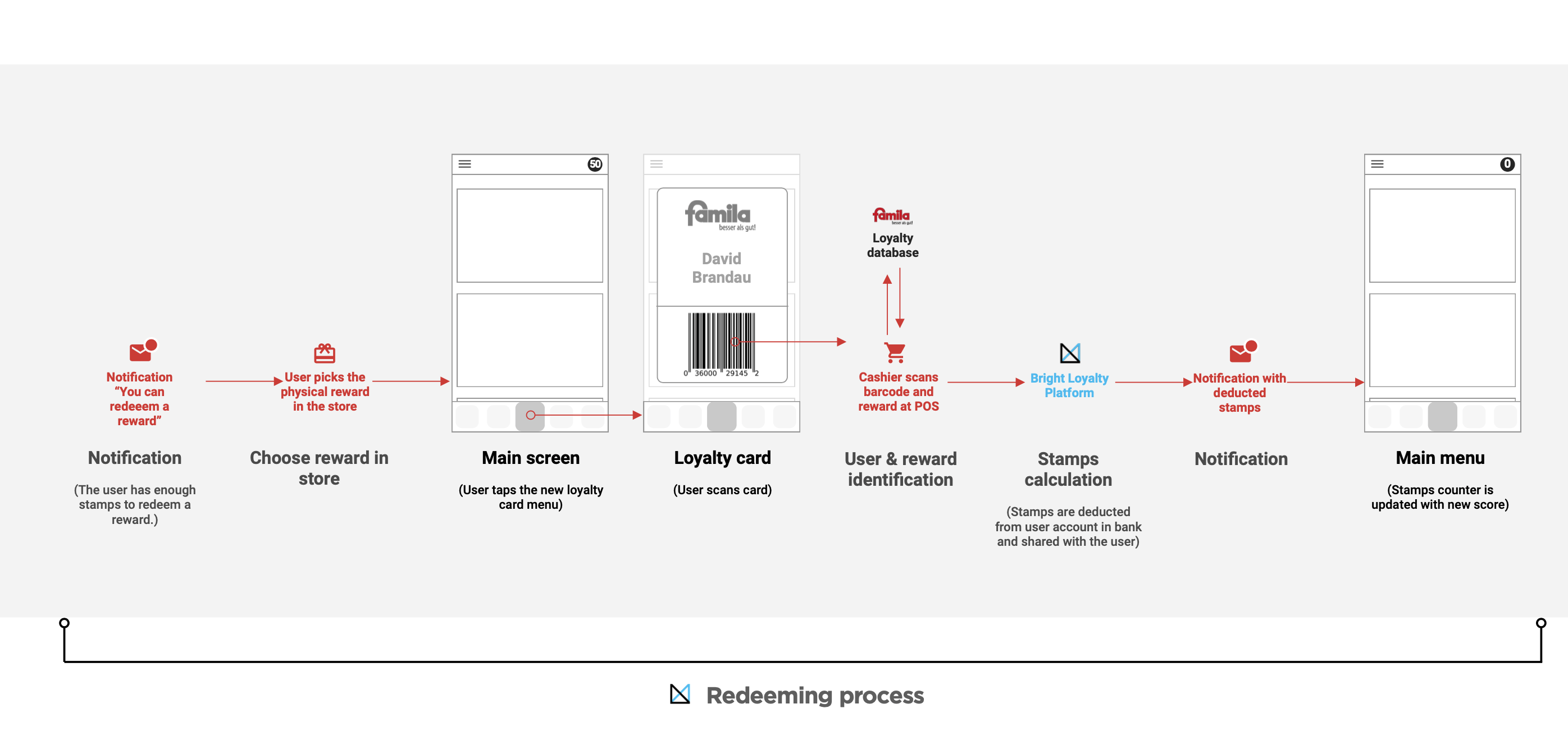
5. Redeem reward
Visual Design
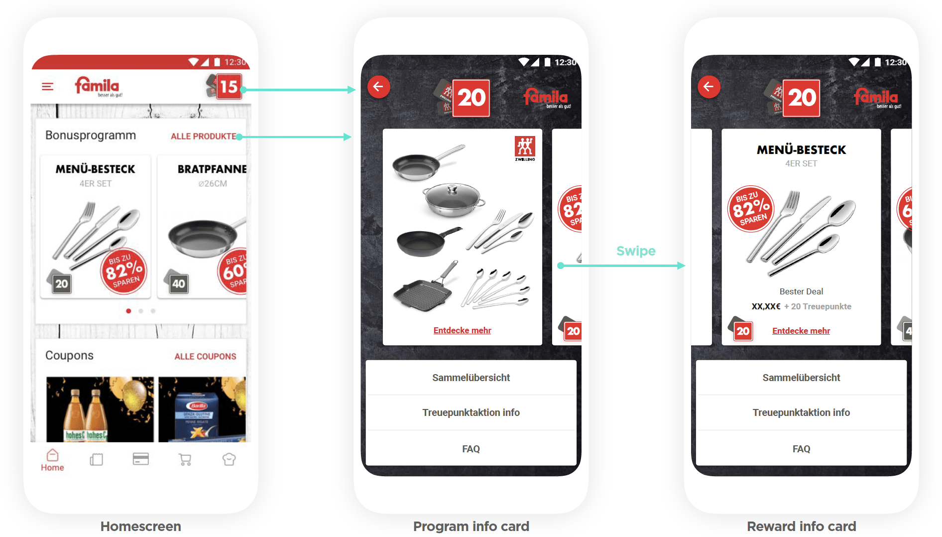
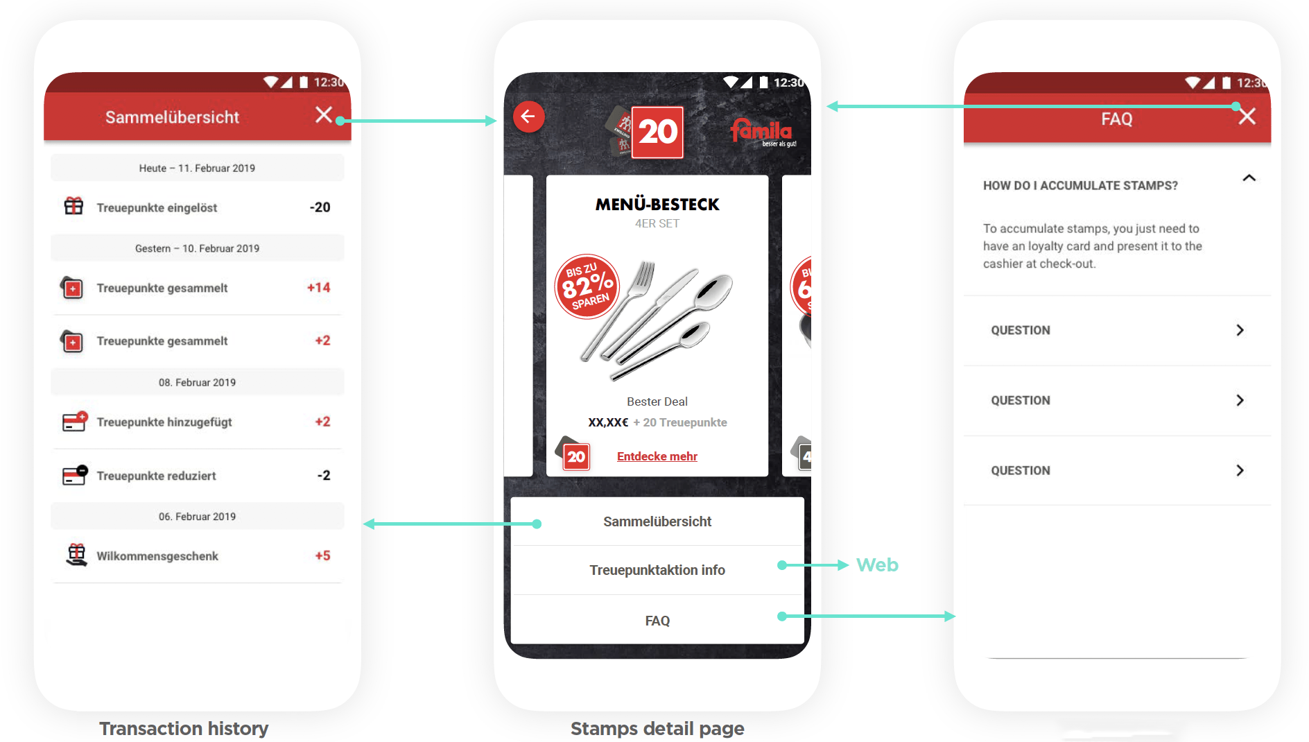
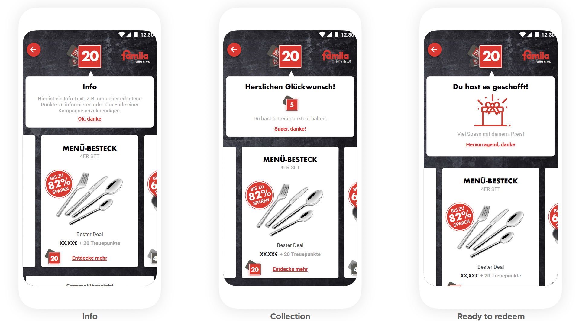
I integrated the loyalty program seamlessly into the app's information architecture, ensuring a smooth user experience. The visual design complemented the loyalty program, enhancing the app's overall appeal.
Conclusion
The solution received positive feedback from Famila users, who appreciated the enhanced relevance of the app in their daily lives. The integration of the loyalty program and app was successful, delivering a seamless experience for users. Despite not conducting a complete usability test due to time constraints, initial tests with friends and colleagues provided valuable data. The next step involves analyzing live app data and continuously improving the app to encourage frequent usage, keeping the client's business goals in mind.